Project Overview
LBC, one of the Philippines’ largest logistics companies, approached me after years of struggling with an outdated and inconsistent website. They wanted a fresh, modern experience that matched their scale and made it easier for customers to complete essential tasks.
Goal
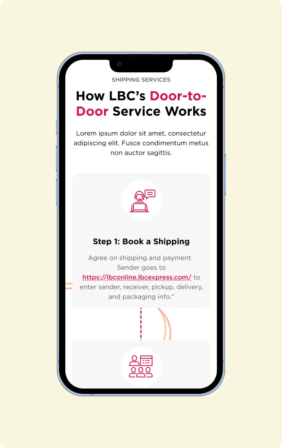
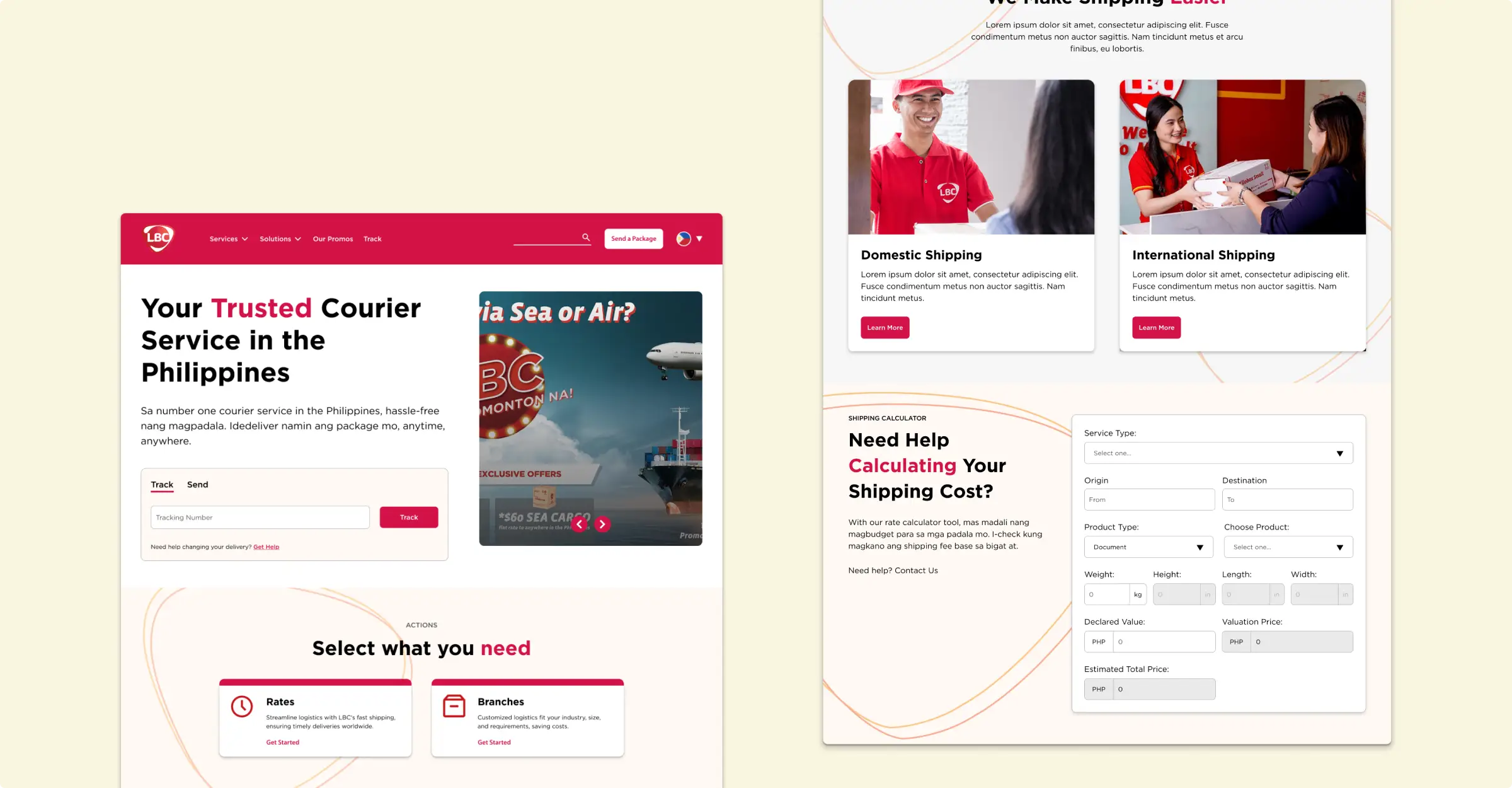
The goal was to create a clearer, more intuitive experience that allowed customers to track shipments, book services, and find branch locations with ease. By simplifying key user journeys and modernizing the interface, the new design aimed to reduce friction and better support the way people interact with logistics services today.
The Challenge
Their website felt cluttered, confusing, and visually disconnected from their strong brand identity. Key user actions, like tracking shipments or finding branch locations, were difficult to navigate, and the internal team found content updates slow and error-prone. LBC needed a complete digital refresh that improved usability, strengthened their brand presence, and delivered a smoother customer experience.
Solution
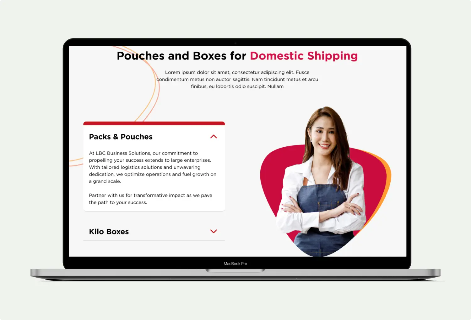
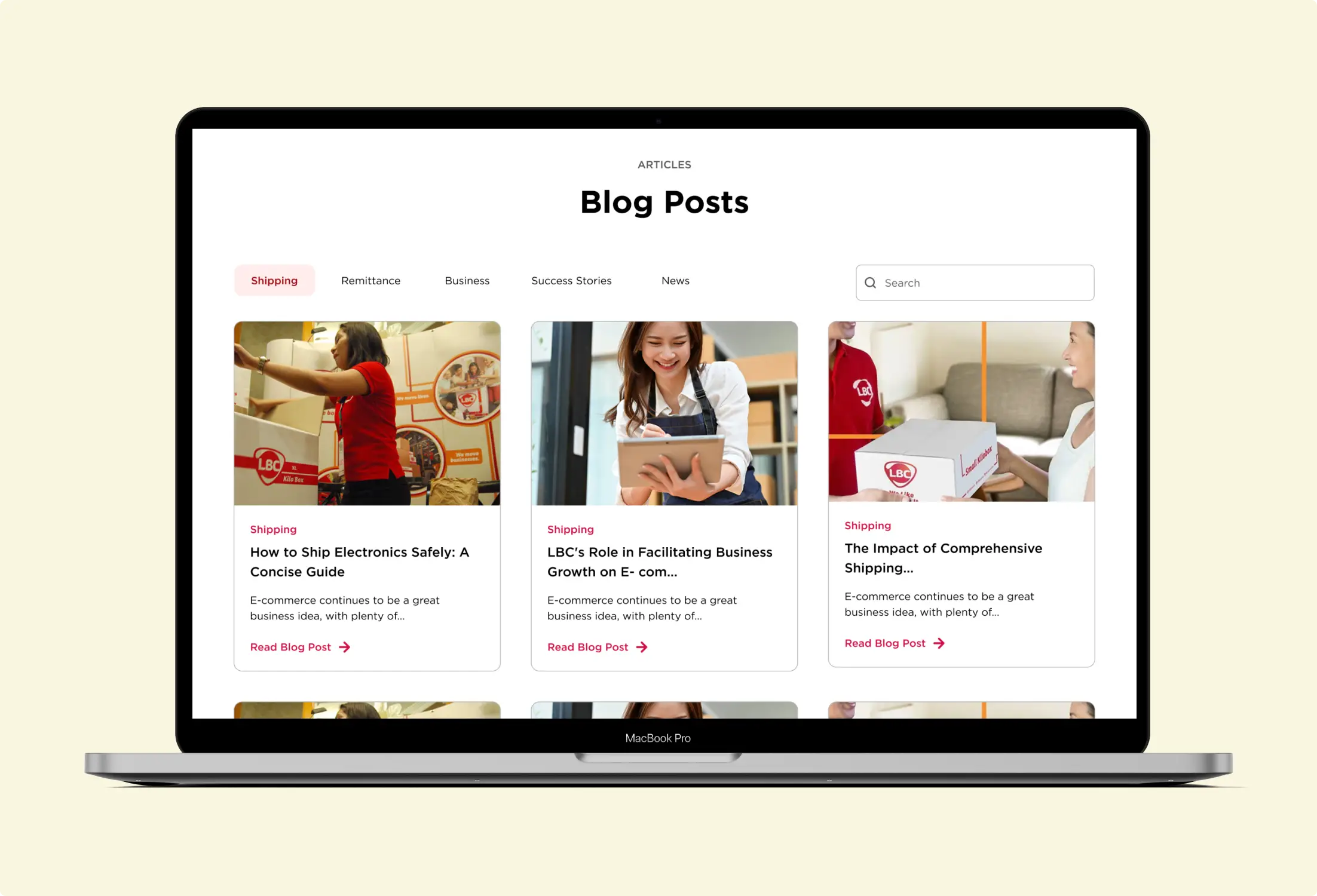
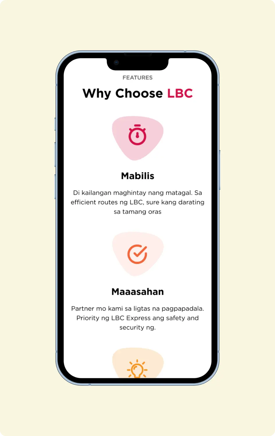
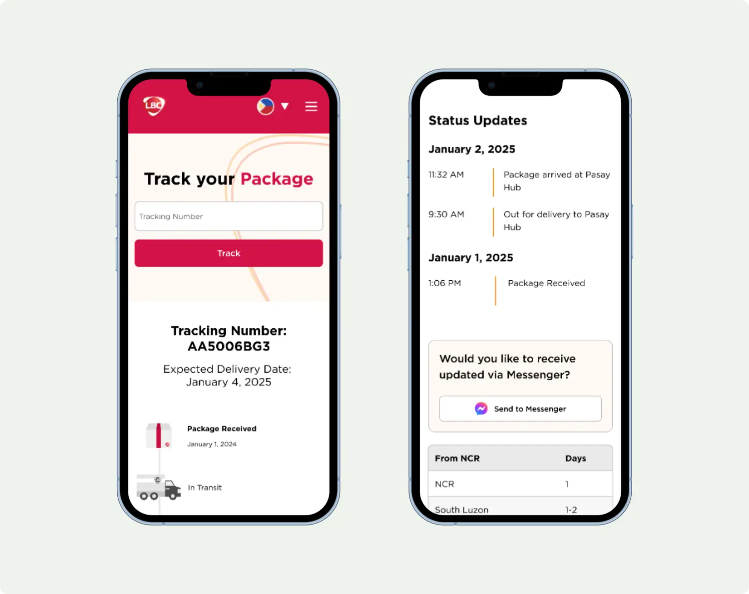
I redesigned LBC’s website using their existing brand guidelines as the foundation. The new layout is cleaner, easier to navigate, and focused on helping users quickly track shipments, book services, and find branch locations. I simplified the pages, organized information more clearly, and made sure the design works smoothly on mobile. I also created reusable design elements so their team can update the website more easily in the future.
Design System
To support long-term consistency, I created a comprehensive design system that standardized typography, color usage, spacing, icons, components, and interactive states. This system gives LBC’s team a reliable visual language and a reusable component library—making future updates faster, more consistent, and easier for designers and developers to implement.